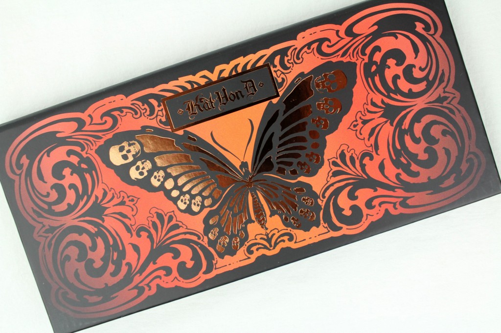
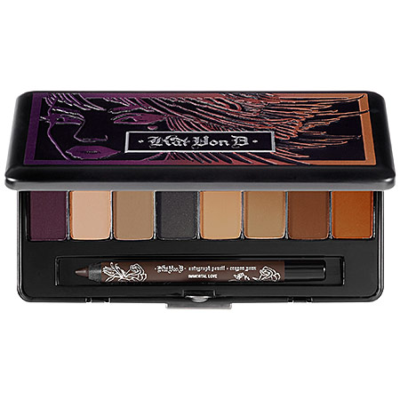
the Kat Von D Monarch palette

If you’ve been reading for a while you may remember that I’ve been looking for a sepia eyeshadow, and was for a while considering the Kat Von D Ladybird palette, though in the end I had too many reservations and didn’t go for it. I’m so glad I didn’t, as Kat Von D released two new palettes this month with new colors and formulas, one warm, one cool. Guess which one I liked more?

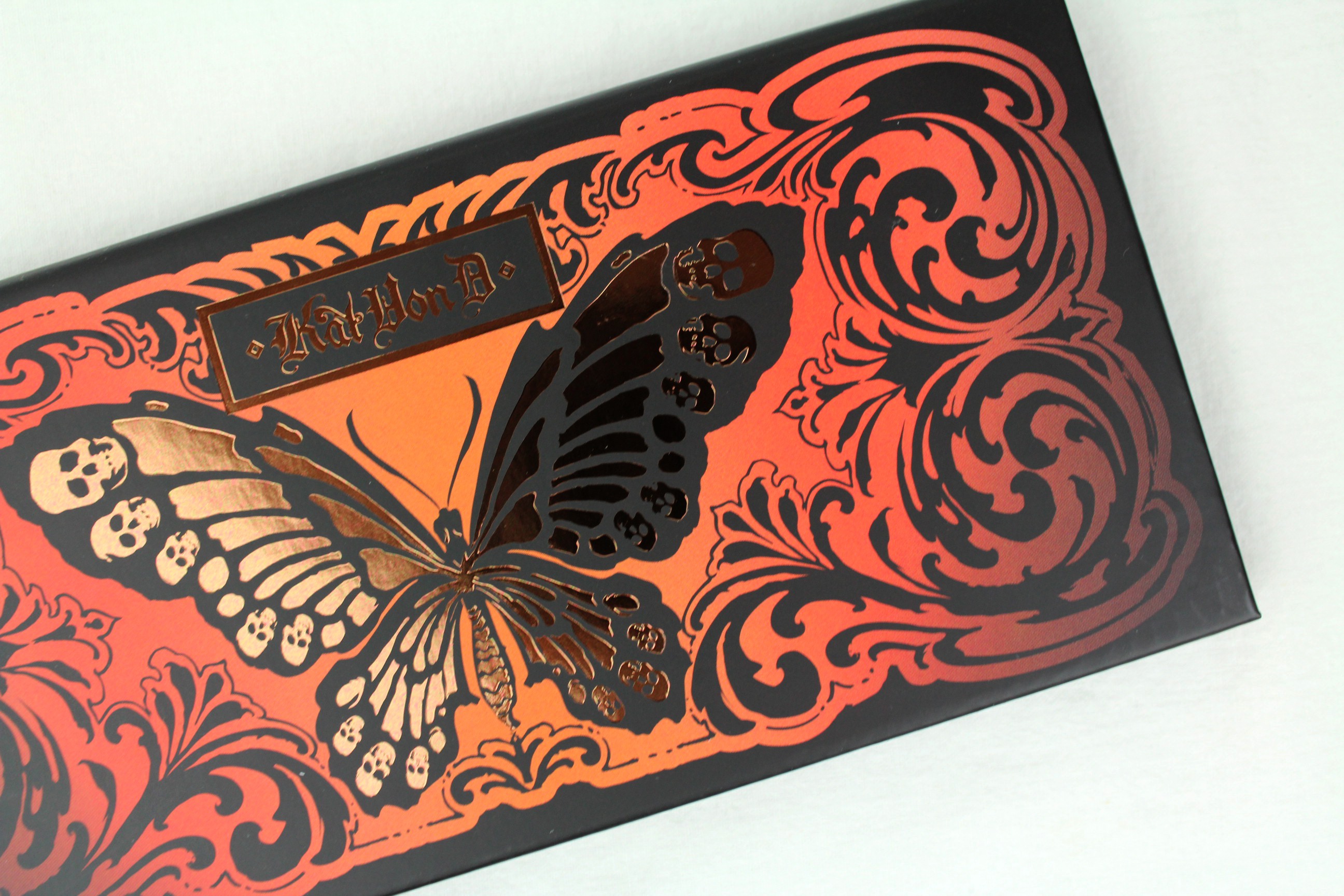
IMG_2737the warm one

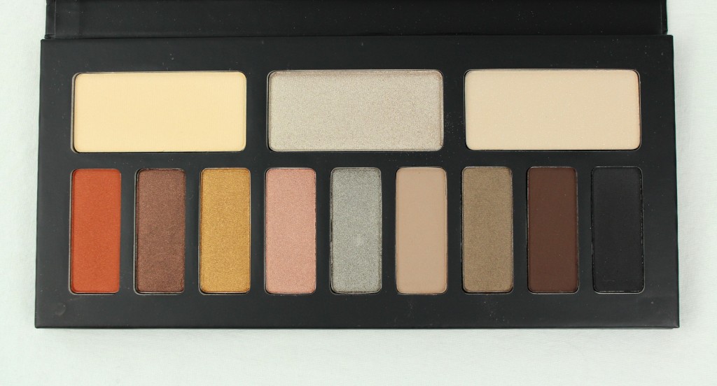
I picked up the Monarch palette, which wasn’t even on the shelves yet in Sephora last week but they sold it to me anyway. The colors were, are, irresistible to me. This is what I wanted the Urban Decay Naked palette (which I don’t have (or want) in any incarnation) to be. Taupe, beige, bronze, gold, champagne, brown, russet…everything I like best, and with lovely, buttery textures.

IMG_2740

See that shade on the left?? Are you seeing??

This already has great reviews online, and it deserves them. I haven’t had much time to play around with it yet but I’ve been swatching and musing, and I am pleased. I have some reservations about the top right base shade, which has some oversized glitter, but this is the only negative to report so far. This should be on shelves officially in the next couple of weeks, so if you’re near a Sephora (this is a Sephora exclusive), I urge you to check it out. The other palette is nice, too, with blues and stuff, but, you know. This one is better.

I’ve been making a lot of decisions based primarily on color lately, and color seems to be playing an increasingly significant role in my vision generally (in all types of choices). Somehow color is jumping out at me more, seems more important, more powerful and more poignant than it has been in the past. It’s always hard to tell if I am imagining these things. Still, it does seem I am struck down (smitten, really) more often by some singing color these days. I am the same, perhaps, only more so.
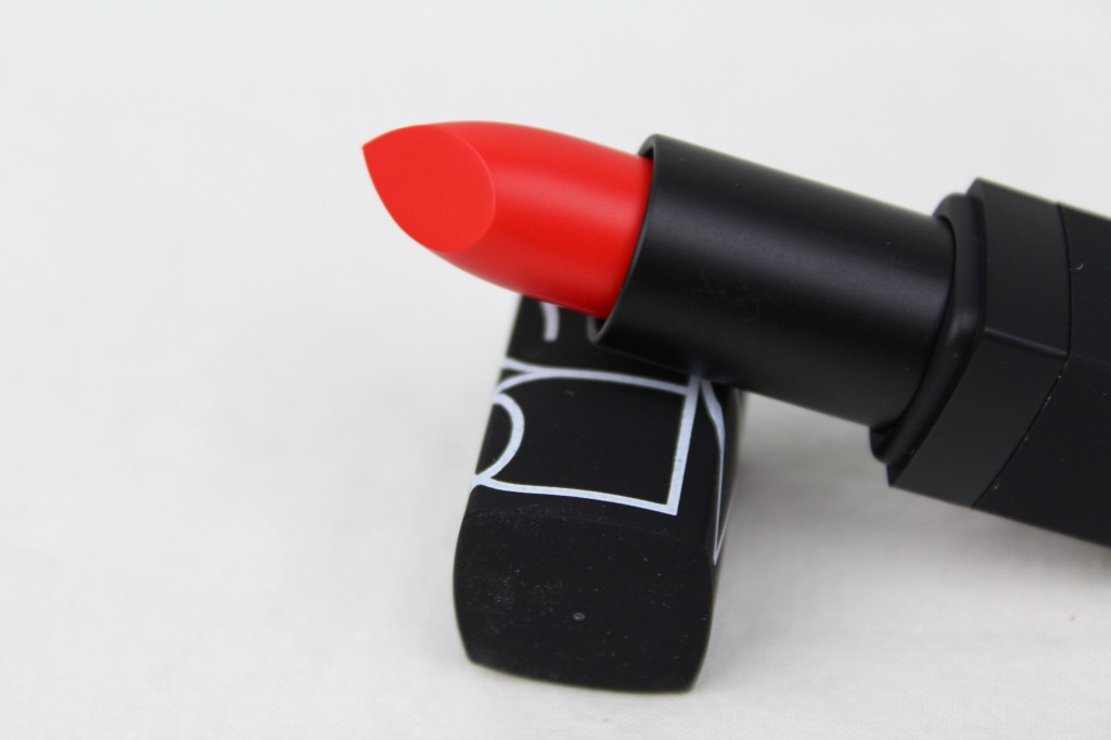
on the lips: NARS Heatwave lipstick

IMG_5978I know I am not alone in often resorting to subpar formulas for the sake of a tremendous color. That is what makeup really comes down to, for me, a straight issue of color. Do I love it? Do I want it? Is it worth it?

Color has powerful effects on us! Or can have. There are studies. I have immediate, often visceral responses to colors, for good or ill.

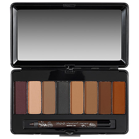
I’m debating this eyeshadow palette right now, the Kat Von D ladybird palette, just for the sepia color on the end. I hardly even wear eyeshadow! I have no money to waste! But this color…it is exactly, exactly the color I have been looking for. I just want to gaze at it and marvel at it. And maybe I would wear it! If I had that perfect color…(is how it goes in the brain).

p378616-av-01-Lhero

You see, on the far right, what I mean? That rusty, burnt sienna color? I have seriously been looking for a sepia eyeshadow like this for years! The rest of the palette is nice, too, conveniently.

s1467166-main-LheroHelllooooo…

I have been thinking about makeup this way constantly lately, as a tool for controlling color–hills and valleys of color, planes and angles of color–, and the paradigm works every time. A nice simplicity to it.

Uhh. Where was I? Oh, yes.

Ideally, though, you don’t have to compromise with the formula, and in NARS Heatwave (called ‘semi-matte’ and accordingly matte but not in that unfriendly way) we see a happy confluence of form and function. A brilliant, almost neon red*(which sometimes plays a heavily saturated neon coral) that performs exactly how you would hope. At least, exactly how I hoped. If I’d had it at the time, I would have included Heatwave with my earlier red-orange/orange-red picks.

I was in no way disappointed, and perhaps you begin to gather how particular I am.

*Wearing it here.