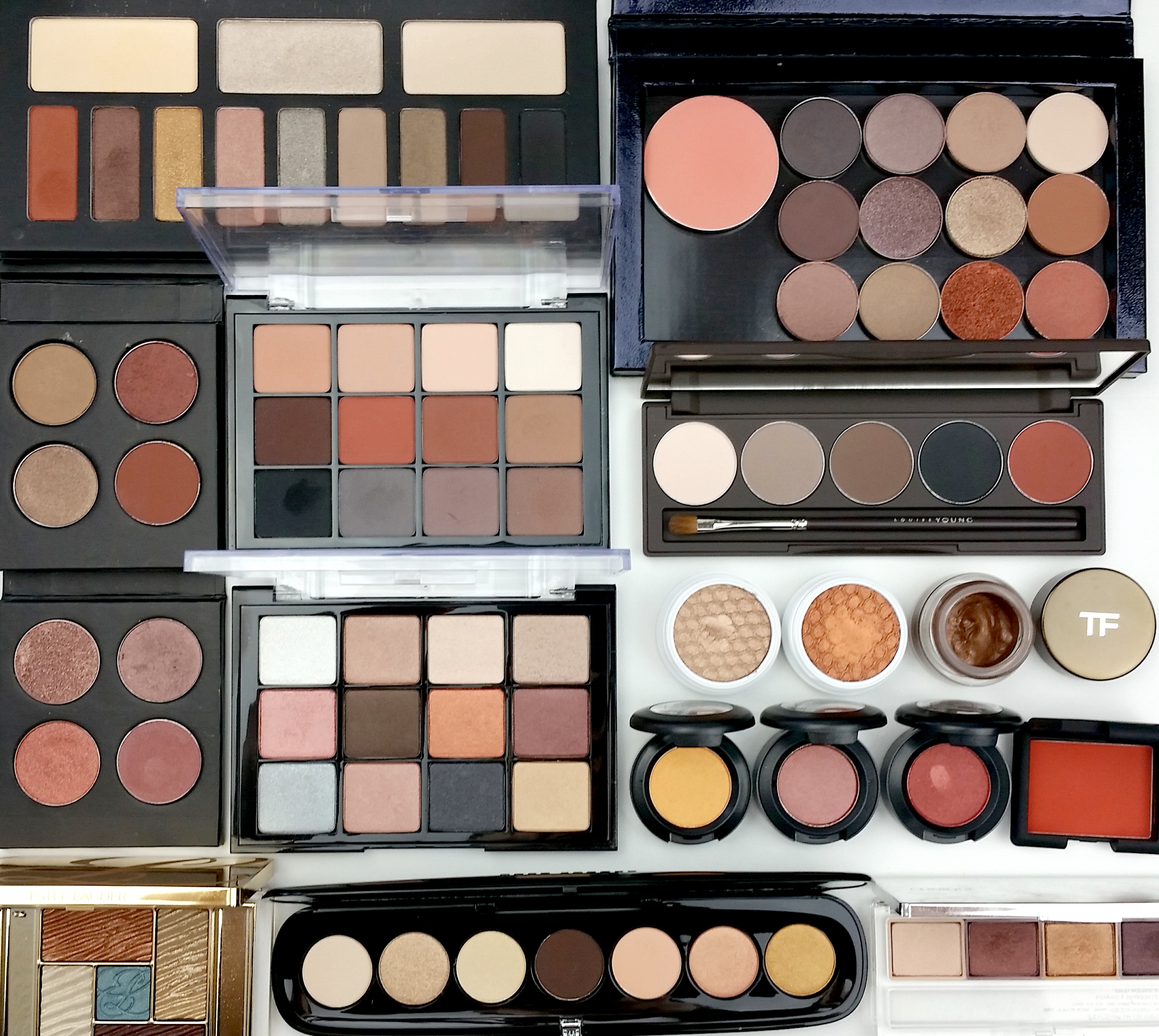
Last week I was shopping for a few shades to customize a large Z-palette (top right palette below), occasioned by MAC’s $6 pro pan sale. How do you build a palette? That is, how do you build your ideal palette? I pulled out some of my favorite palettes to study, determine what I like about them. See how they tick.
They display a distinct trend…
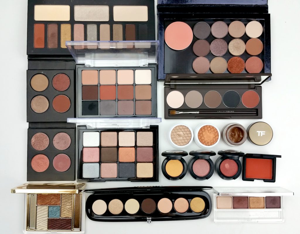
L-R, as if reading: Kat Von D Monarch palette, Z palette (ft. Mac and Makeup Geek shadows), MAC shadows in custom Japonesque palette, Viseart 01 Neutral Matte, Louise Young Essential Eye Palette, Makuep Geek shadows in custom Japonesque palette, Viseart 05 Sultry Muse, Colourpop shadows, Tom Ford cream shadow, MAC singles, NARS single, Estee Lauder Bronze Goddess, Marc Jacobs 212 The Dreamer, Clinique 03 Morning Java
It’s not so easy, in a sea of shades, to create a compelling combination. Easy to make something nice, hard to make something I like even more than my favorites. I’m not finished, actually, though the Z-palette (the blush there is MAC Peaches, if you’re wondering) is full for now. Need to pull in a few more matte shades, something very dark and something to be a great transition shade for my skin tone (read: a tiny bit darker without being too dark). It’s an engrossing color exercise, feels much like a puzzle. I keep shuffling the shades around, deciding not only what shades to include but in what arrangement. Feeling satisfyingly territorial about it.
It seems revealing, to see what colors a person would choose, like it would reinforce something you already knew, or show you something you hadn’t realized about them (about yourself).
[I’m working on the 2 little 4-pan Japonesque (Japonesque makes the shell) palettes as well, simultaneously, as related but independent puzzles.]
I want something that is effectively a Viseart Neutral Matte palette that incorporates shimmers and metallics. Once I’ve added a few things and rearranged to my heart’s content I’ll let you know which shadows made the cut. Have you ever built a custom palette? How did it go? Favorite shades?
x
