­
matte - The Seventh Sphinx - Page 4

the tuxedo blazer

IMG_2096

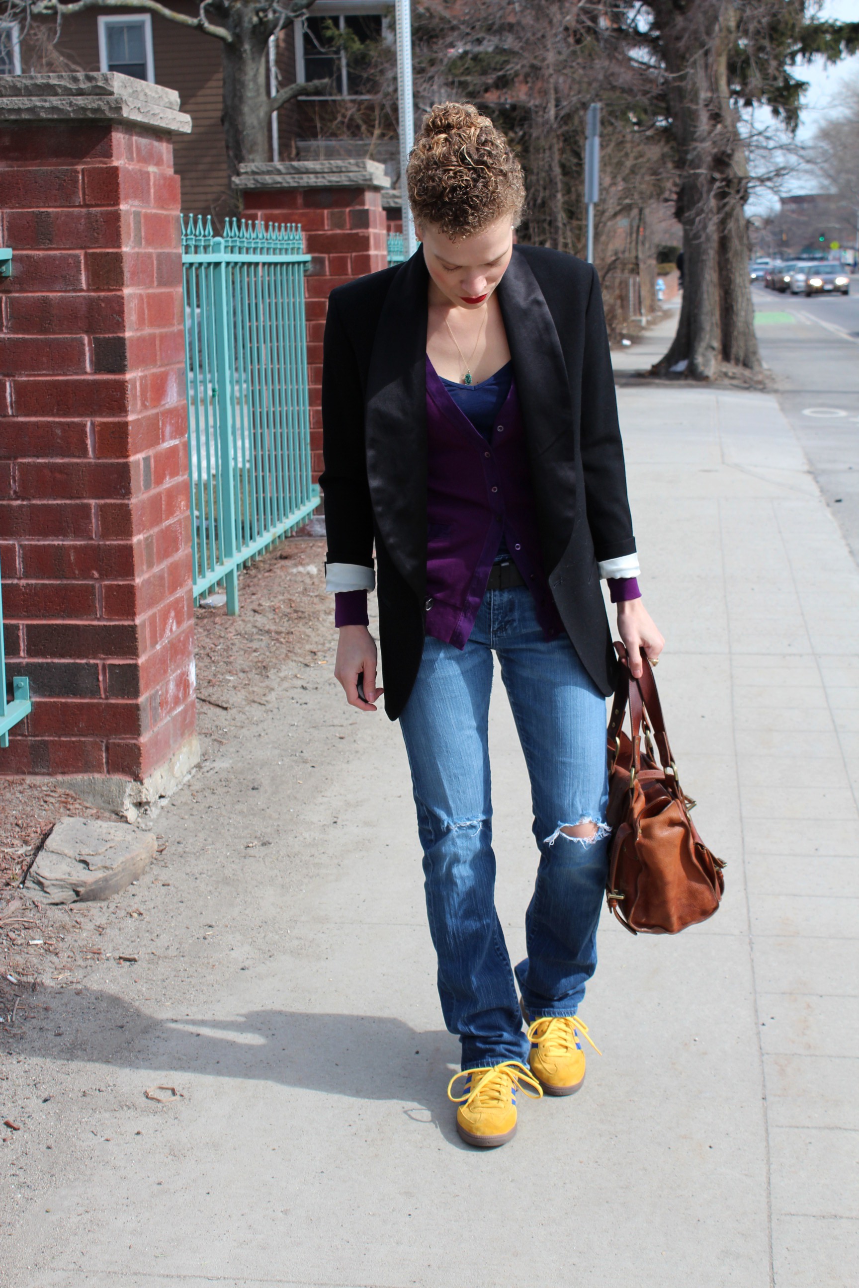
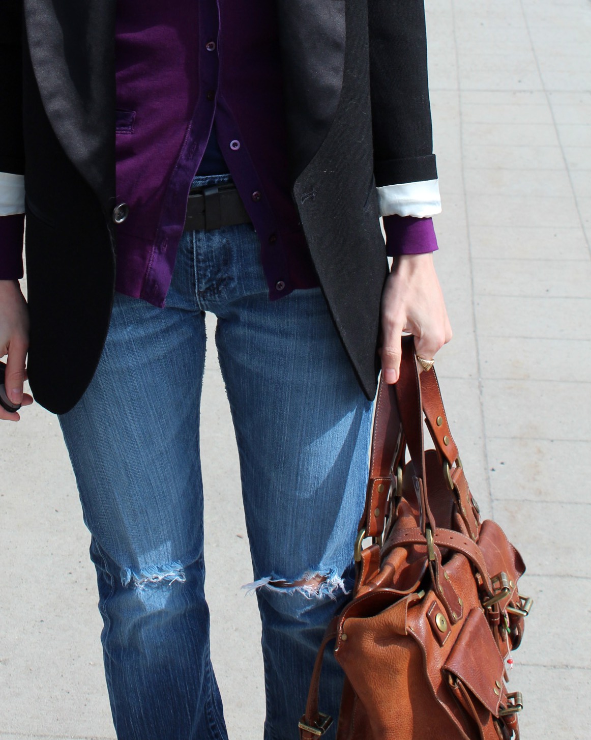
One of the trends I like is that of the casual tuxedo blazer, especially with worn-in boyfriend jeans.

IMG_2093

IMG_2129

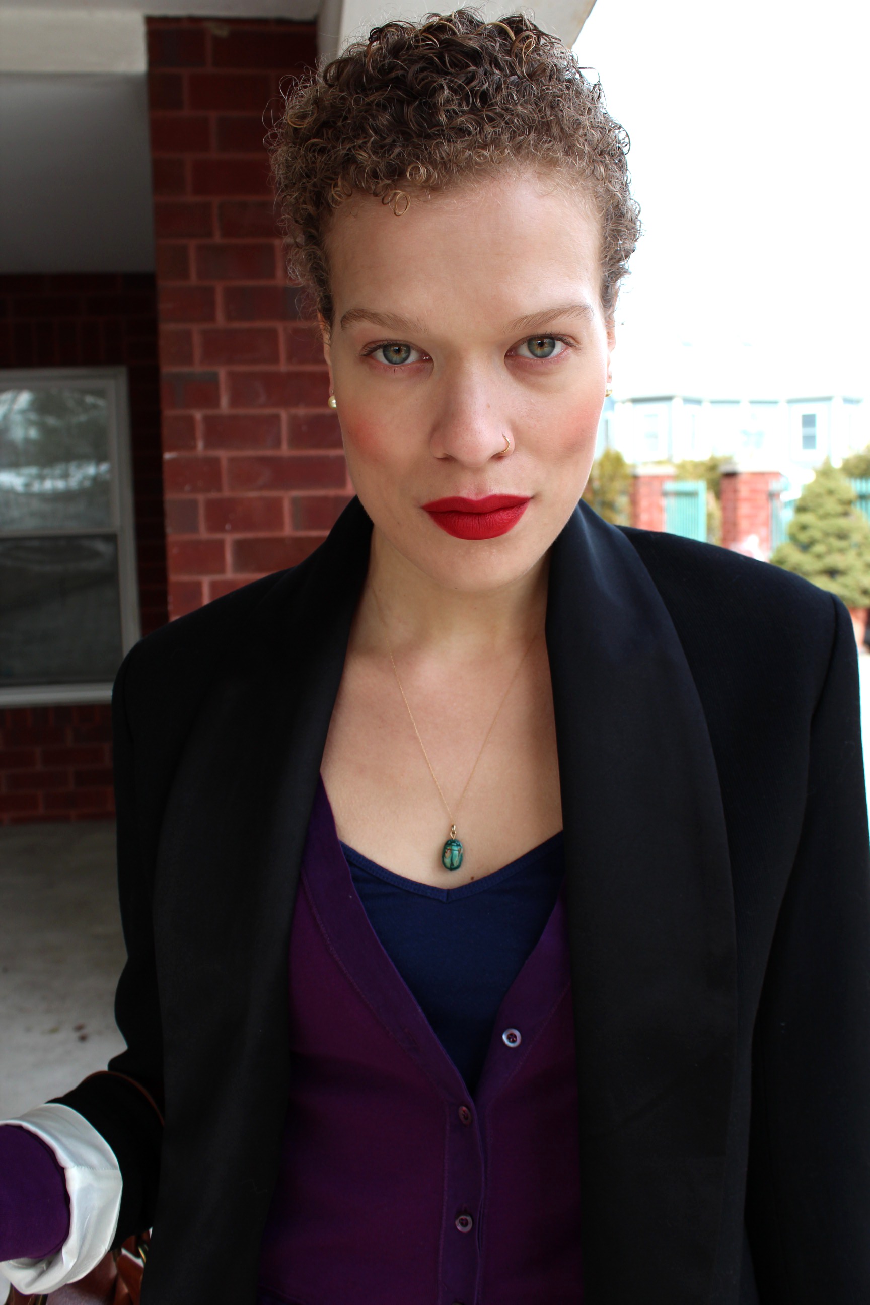
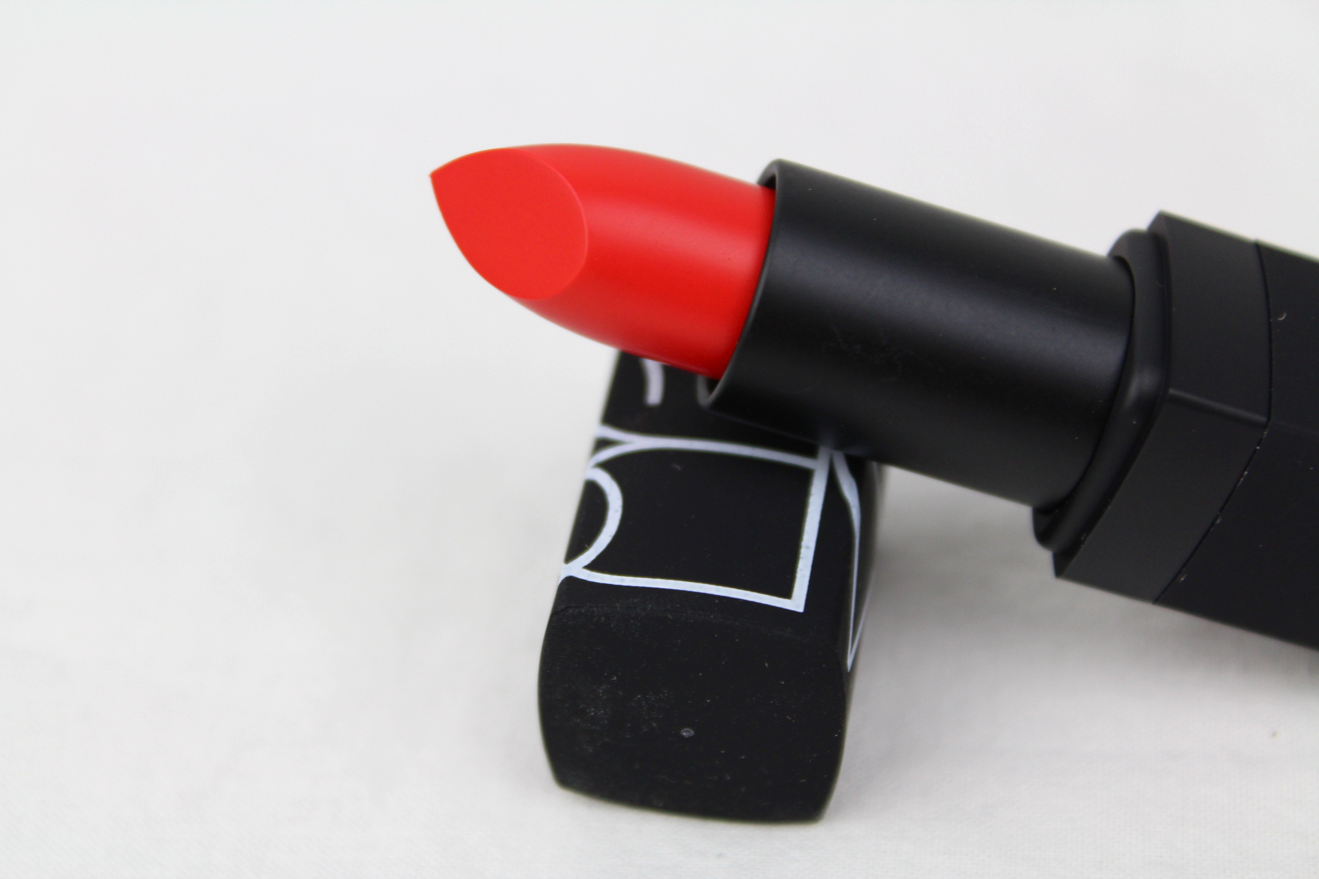
You know how there’s this kind of transition area between the lips and the not-lips, maybe 1-2mm? I was experimenting with coloring that area in (I usually don’t), to maximize the lip territory. It had a pretty dramatic effect to me, a little weird (unfamiliar) but not technically overdrawn (which nearly always looks off), just… bigger. This reminds me of my thoughts about pearl stud sizes, and how 1mm can make such a difference in the appearance of the size. Faces aren’t very big, was the conclusion; small changes have an amplified effect.

I went to the grocery store after this and an 8 year-old boy actually craned his head as far as it would go to watch my lips walk by, his mouth slack with distraction. This speaks to makeup being both arresting and slightly scary. I get a lot of positive feedback from this 8 and under demographic – the younger the child, the more bright lipstick seems to delight them. I’m right there with you, kids. What will those wacky giants do next? I don’t know either!

IMG_2142

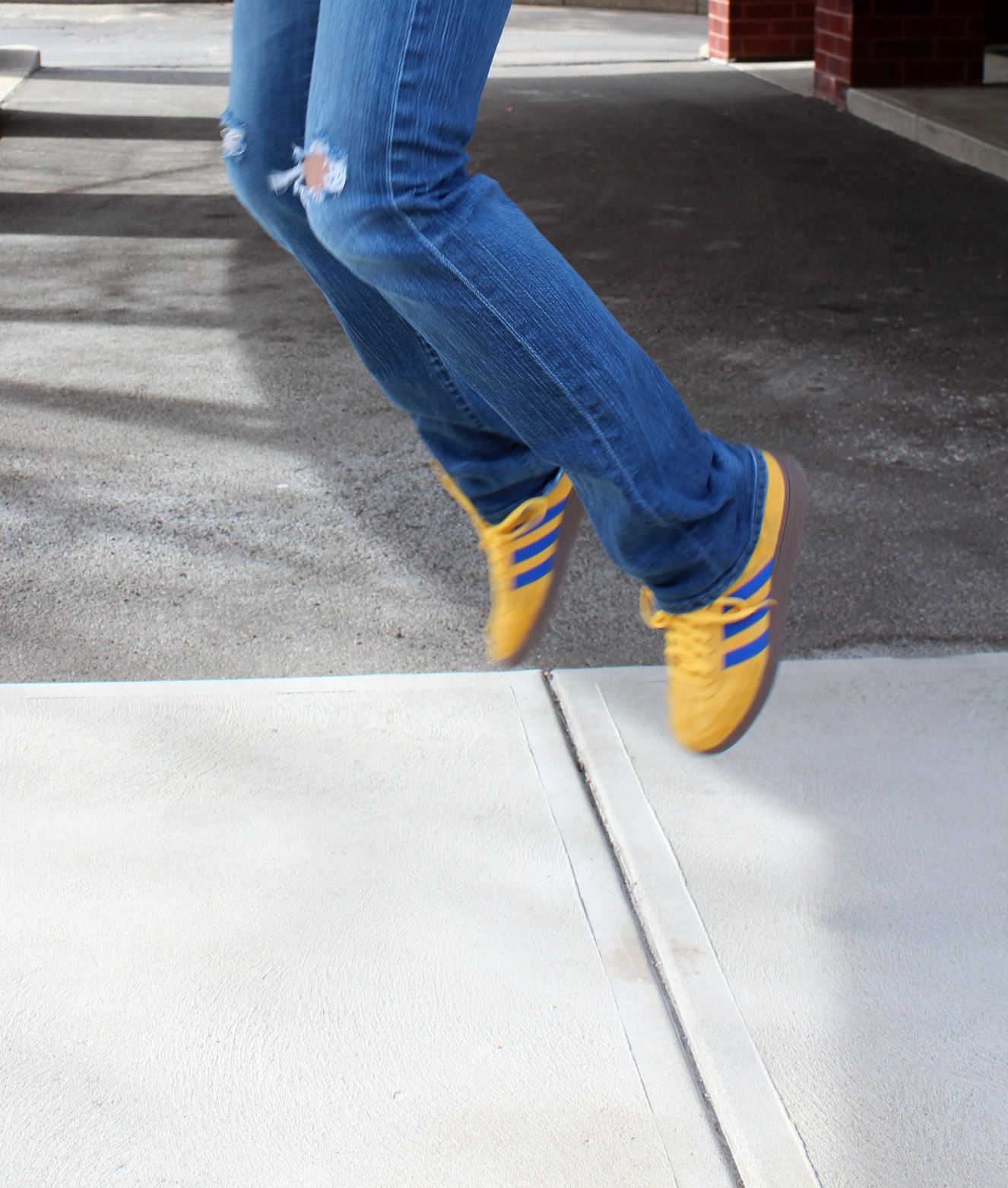
Wool tuxedo blazer from Isabel Marant for H&M, AG jeans (thrifted), J. Crew cardigan, Old Navy camisole, Adidas Spezial sneakers, Pearl Paradise golden akoya studs, scarab necklace. On the lips: Revlon matte lipstick in Really Red (I’m sure I’ve mentioned before how much I like these Revlon matte lipsticks) with a dark red Avon pencil…Cabaret or something? And this is the NARS Exhibit A blush again, which I like as much as ever. I find it quite youthful, not a sophisticated tawny shade but a true blood-in-the-cheeks, fresh-from-the-cold shade.

IMG_2145

AND: Hurrah for daylight savings.

x


on the lips: NARS Heatwave lipstick

IMG_5978I know I am not alone in often resorting to subpar formulas for the sake of a tremendous color. That is what makeup really comes down to, for me, a straight issue of color. Do I love it? Do I want it? Is it worth it?

Color has powerful effects on us! Or can have. There are studies. I have immediate, often visceral responses to colors, for good or ill.

I’m debating this eyeshadow palette right now, the Kat Von D ladybird palette, just for the sepia color on the end. I hardly even wear eyeshadow! I have no money to waste! But this color…it is exactly, exactly the color I have been looking for. I just want to gaze at it and marvel at it. And maybe I would wear it! If I had that perfect color…(is how it goes in the brain).

p378616-av-01-Lhero

You see, on the far right, what I mean? That rusty, burnt sienna color? I have seriously been looking for a sepia eyeshadow like this for years! The rest of the palette is nice, too, conveniently.

s1467166-main-LheroHelllooooo…

I have been thinking about makeup this way constantly lately, as a tool for controlling color–hills and valleys of color, planes and angles of color–, and the paradigm works every time. A nice simplicity to it.

Uhh. Where was I? Oh, yes.

Ideally, though, you don’t have to compromise with the formula, and in NARS Heatwave (called ‘semi-matte’ and accordingly matte but not in that unfriendly way) we see a happy confluence of form and function. A brilliant, almost neon red*(which sometimes plays a heavily saturated neon coral) that performs exactly how you would hope. At least, exactly how I hoped. If I’d had it at the time, I would have included Heatwave with my earlier red-orange/orange-red picks.

I was in no way disappointed, and perhaps you begin to gather how particular I am.

*Wearing it here.