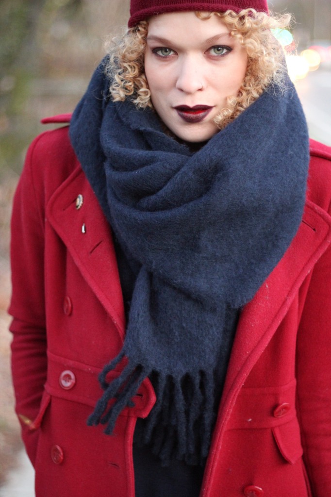
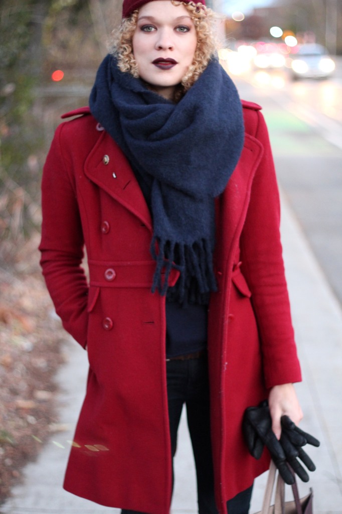
ModCloth invited some bloggers to talk about fall/winter layering, prompting us to choose three items (tops, from them) and explain the selection. I like this kind of style challenge, where some aspect or another is limited, controlled. The challenge for me was that so many of their tops are prints of some kind and working with multiple prints can be difficult. They are thin on basics, too, as it’s not what they do (they do cute, often retro-inspired statement pieces). So!
idea 1: sandwiched plaid
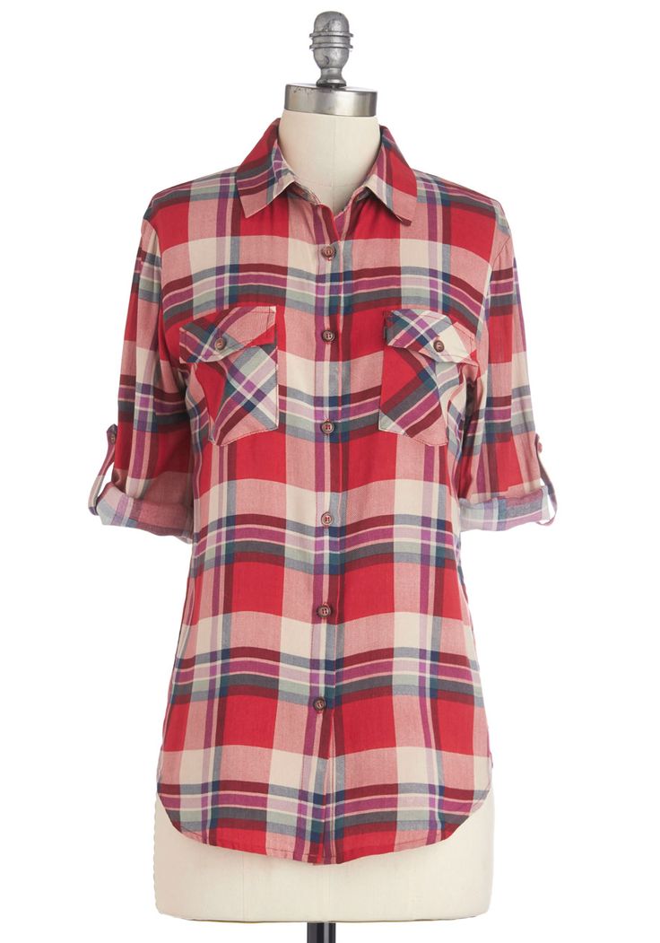
I like to keep things clean, usually, meaning solid, meaning no prints, but now and then I’ll go for one. An easy way to deal with a print, even a dramatic one, is to break it up, sandwich it between two solids. Ideally, for me, between muted and harmonious solids.
Something like this basic plaid buttoned shirt
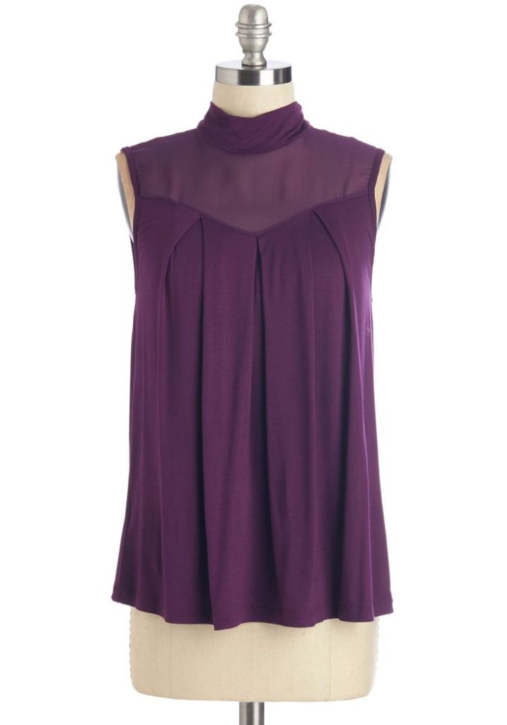
between this sweetheart mock turtleneck sleeveless number (I like a button down with a turtleneck, and this one, sort of sheer/formal, would be appealingly strange, unexpected next to informal plaid), the color pulled from a minor note of the plaid pattern,
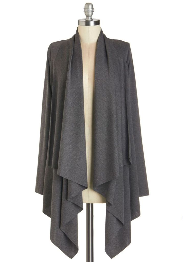
and this slouchy grey (read: neutral) cardigan, with really any kind of belt thrown over the whole affair, and none of the buttons done up on the shirt. A lot of colors could work here, and they have tons of sweaters.
OK, so this is a tame approach (or some might say chic! Some might say sophisticated!), but pretty foolproof. There is also
idea 2: inverse pattern juxtaposition
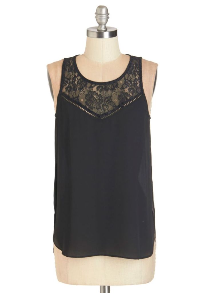
By which I mean some simple camisole base like this
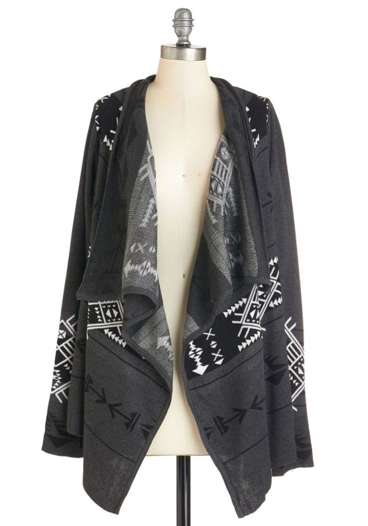
layered with a (more or less) two tone pattern with one color dominant, like this geometric cardigan,
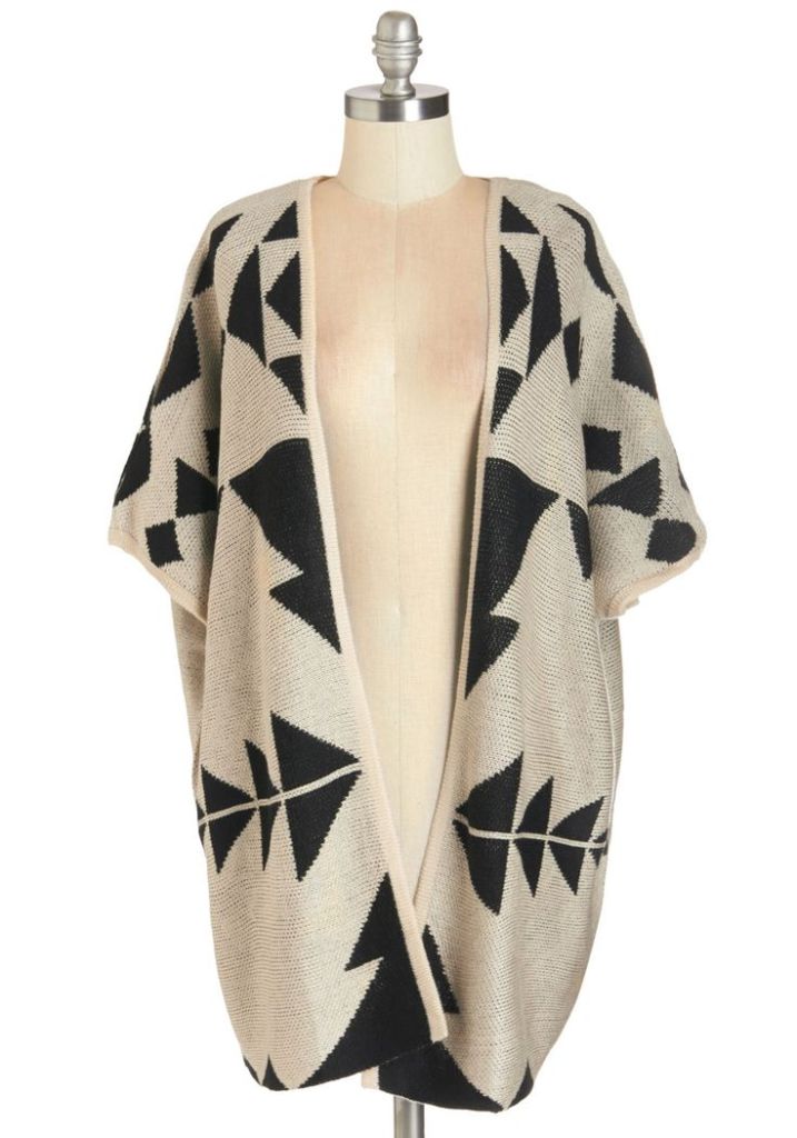
layered with another two tone pattern, this one with the color that is non-dominant in the other pattern now dominant, like this other geometric cardigan (not ideal b/c white vs cream, but you see what I mean, and I often like white and cream together anyway).
If you live somewhere sufficiently cold, you know two cardigans are not unheard of. Maybe no belt on this one. Or maybe a really pale tan leather braided belt.
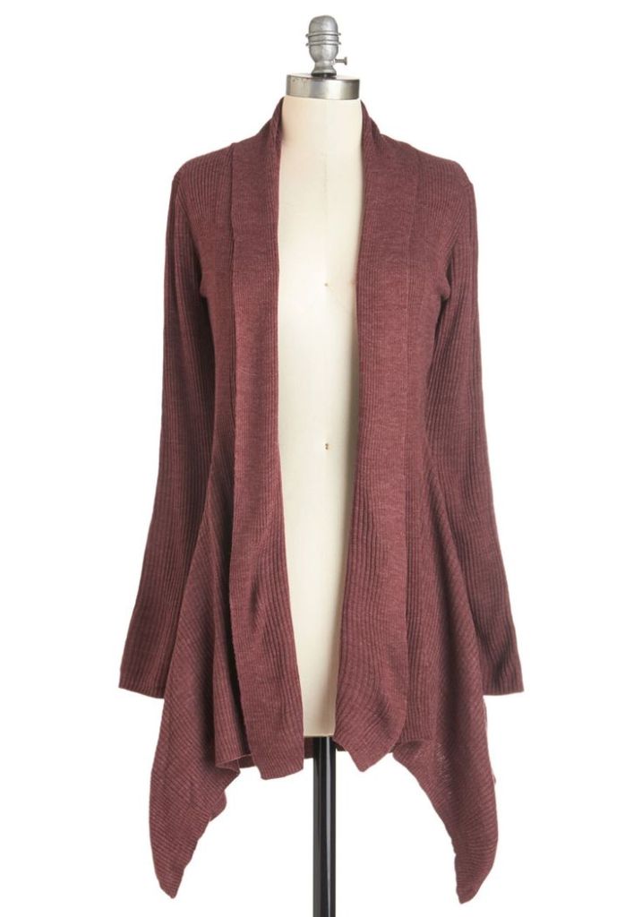
Just a solid color in the middle would be good there, too. Like this.
Layering gets easier and easier with experimentation as you discover what you like and begin to establish strategies to achieve it. Often your wardrobe works for you as you are often drawn to the same colors (not hard to find harmonious combinations) and, even if you prefer patterns, often prefer the same kinds of patterns. Then, too, it’s good to be open to unexpected combinations.
Imagine three layers, all plaids with some common stripe…I would like to see that. Or imagine three very different patterns, all with the same dominant color. Or three identical patterns in three different colors. Or two, with a solid between them, or three beautifully complementary solids…
This is to say nothing of accessories.
images via modcloth.com
